HELLO HAPI
BRANDING
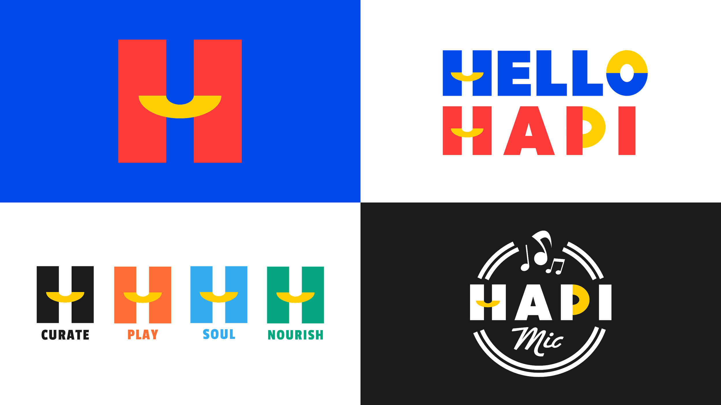
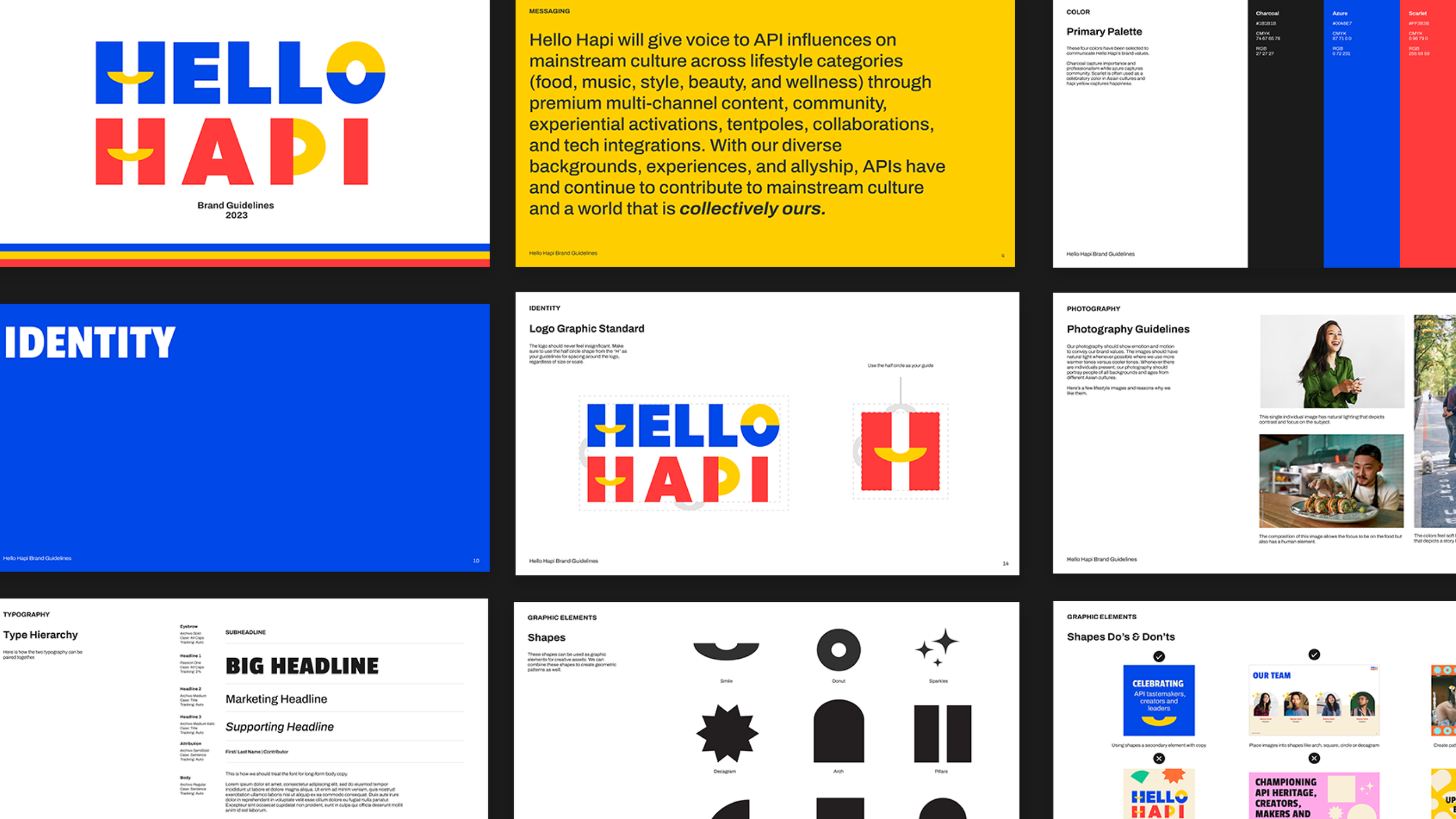
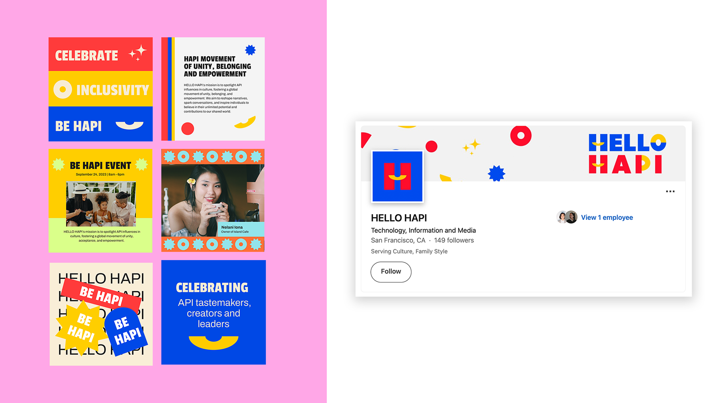
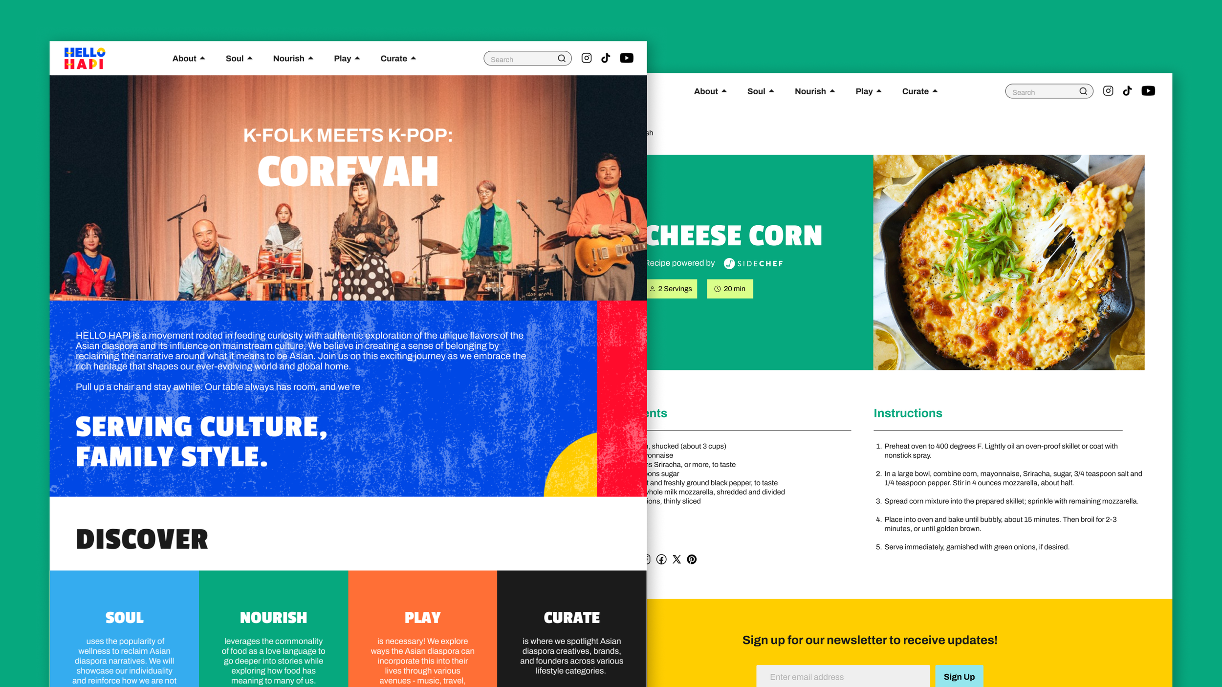
HELLO HAPI is the first ever AANHPI woman founded media, content and community platform that addresses the intersection of Asian Pacific Islander heritage and culture. For their brand identity, I created a logo suite, along with a brand guideline. I also created a set of graphic elements, social media, presentation templates and website design. The inspiration behind the logo design was based on the word “HAPI” where we took the crossbar of the “H” to create a smile-like shape and carried that through any half-circle shapes within the logo. The primary colors chosen were also intentional in that red, blue and yellow are common colors within Asian country flags. Paired with a range of secondary colors and geometric elements, the rest of the brand identity conveys a bold yet playful look.


HELLO HAPI Presents: Have You Eaten?
Additionally, I created the branding for HELLO HAPI’s podcast called “Have You Eaten?” — a podcast dedicated to highlighting the connections between wellness, mental health and multifaceted layers of the Asian diaspora community.